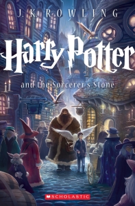
I was talking to Olive earlier about the differences between UK and US book covers. Now usually I always think the UK covers are better, with one notable exception: Harry Potter.
This summer I was lucky enough to visit England for 6 weeks. While there I HAD to visit Platform 9 3/4 of course. After taking an awesome picture with Harry’s trolley, I visited the Platform 9 ¾ gift shop where you can buy wands, house robes, flying brooms, scarves, a poster with the entire first book in 5-pt font, and–best of all–a complete set of the Harry Potter books. Imagine my horror when I pulled Harry Potter and the Philosopher’s Stone off the shelf and this picture appeared in my hand:
Dear God. The horror. I shivered to realize that the rest of the books have the same sort of cover! Why does this travesty exist? I don’t know. All I know is I could spend hours looking at the US covers and noticing new details I hadn’t seen before. Take Harry Potter and the Goblet of Fire for example.
Look at all the detail on that cover, all the beautiful colors, the little goblet of fire in the corner. I didn’t fully appreciate the covers of these books until a couple of years ago when I realized that when you took the cover off the book and straightened it out, the picture continues to the back.
England, you need to get on the ball with this. Your HP covers are horrible.
If you haven’t had a chance to admire the beautiful artwork of these books <the non-British versions>, take a look at them by going to your closest bookstore and buying all of the originals in hardback (or looking at your bookshelf where they are, of course, on prominent display).
On another note, did you know that in honor of the 15th anniversary of our beloved series, a new artist was chosen to create new covers? Why yes that did happen. Now I am a huge fan of the old covers (as you might be able to tell), and even I have to say that the new covers are pretty darn beautiful. My fav is definitely Harry Potter and the Sorcerer’s Stone. I mean, just look at it:
It’s so beautiful! The colors! The people! Hagrid! Hedwig! Yes, it is true that the cover isn’t a gorgeous, full length beauty, but it is pretty darn good. And look, when you put all the new covers together, the spines show Hogwarts!
Wow. The new artist is named Kazu Kibuishi and he is awesome. I don’t know how they (the eternal they) decided to have this man do the covers but *slow clap*. Nice job.


I like the new covers too! Though the UK covers arent the best but they were the ones I first saw when I read the books. When I finally got the whole set, I was hoping to get the UK covers but there weren’t any. I resorted to the US ones instead.
Don’t diss the UK covers! They are the original and the best covers. (I am biased though, being from England and receiving those covers, from the time I was seven years old – I’m 20 next month!) And also the rarest. You should’ve picked them up whilst you had the chance.
I guess I should specify that I’m an American so I grew up on the American covers.
As an American, the only things I don’t like about the US editions are a couple of the edits to make the language more understandable to Americans. I rather like funny, foreign-sounding Briticisms; it’s truer to the HP culture.
It’s hard to argue that the English covers are more original than the American ones, because both were commissioned at the same time (despite the UK version being published a few weeks earlier).
But I am curious – what do people from other countries think of the US cover art?